Case Study: Roll20
streamlining the user interface of a complex tool menu
Navigate to...
Project Introduction
The Client:
Roll20 is an online platform for tabletop role-playing games (TTRPGs). It features many tools and assets for many different games.
“[Roll20] gave us what we needed, if you knew what you were looking for.”
– user interview
“It took my [game master] six months to learn, and she works in IT.”
– user interview
The Challenge:
The site has been built piecemeal over time and users find the UI of the main gaming page to be frustrating and confusing. Many tools and features are hidden deep in menus and/or poorly labeled. Users reported becoming so frustrated with the UI of the gaming page that they looked for competitors offering a similar platform.
The Goal:
Redesign the main page interface for better consistency, organization, and information hierarchy, thus providing users with a more intuitive UI that they are able to use faster and more easily. The tools should facilitate the game, not hinder it.
“Anything related to any role playing system is working well when the creativity is going, and it is working badly when the system impedes creativity.”
– user interview
Evaluating Current Issues
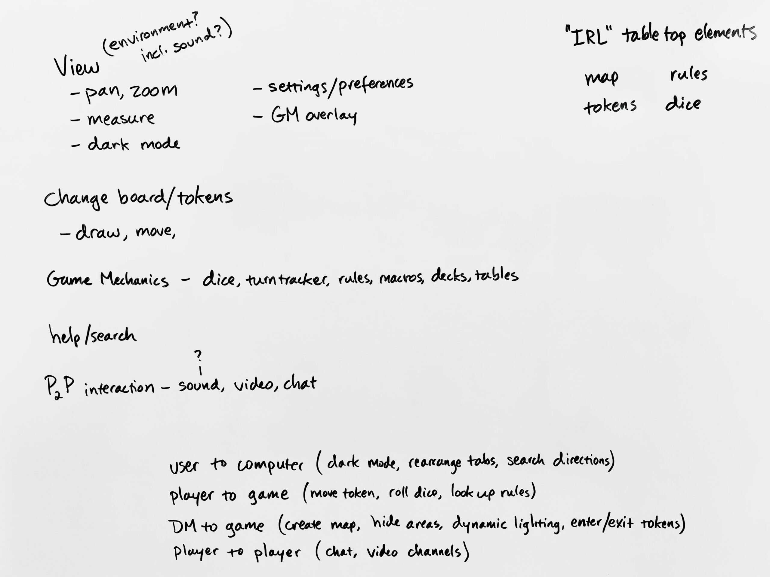
I started by evaluating the existing user interface. I took a visual inventory to catalog the diversity of visual cues that all mean the same thing (three different styles of dropdown menus, for example). I wrote out the current information hierarchy—all the menus and their tools and options. I found the top/surface level of menus to be overcrowded and to include some options that did not need a top-level position (e.g. switching the interface to dark mode). Conversely, I found some interactions buried in second or third-level menus that I would have expected to be on top (e.g. “exit game” requires entering “settings” and scrolling all the way to the end).
I interviewed a handful of Roll20 users about their experiences with the platform. Their input reiterated that the current interface is confusing and disrupted gameplay, causing some users to seek outo other platforms or to use an awkward combination of platforms (one user described using a real-life hand-drawn map on video because working the maps in Roll20 was too difficult).
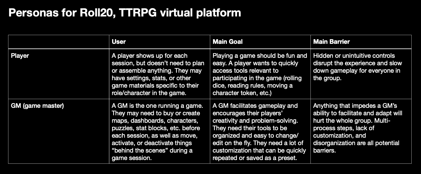
I wrote a brief profile of two main user groups, defined by use case. To keep the project in a reasonable scope, I eventually narrowed the scop to only focus on the first of the two, the player.
Reorganizing the Information Hierarchy
This led to doing card sorts with a handful of users. After their card sorts, the focus group and I discussed categorizing tools in a variety of ways:
- type of interaction (are you interacting with other players, with the mechanics of the game, or with the computer display?)
- frequency of use (which tools are most needed most often?)
- user role (are you the one running the game (thus needing extra tools/space for setup), or only participating in it?)
- similarity (e.g. the zoom tool and the pan tool accomplish similar tasks)
- association (e.g. when you draw, you draw on the map, so the maps page and draw tool should be together)
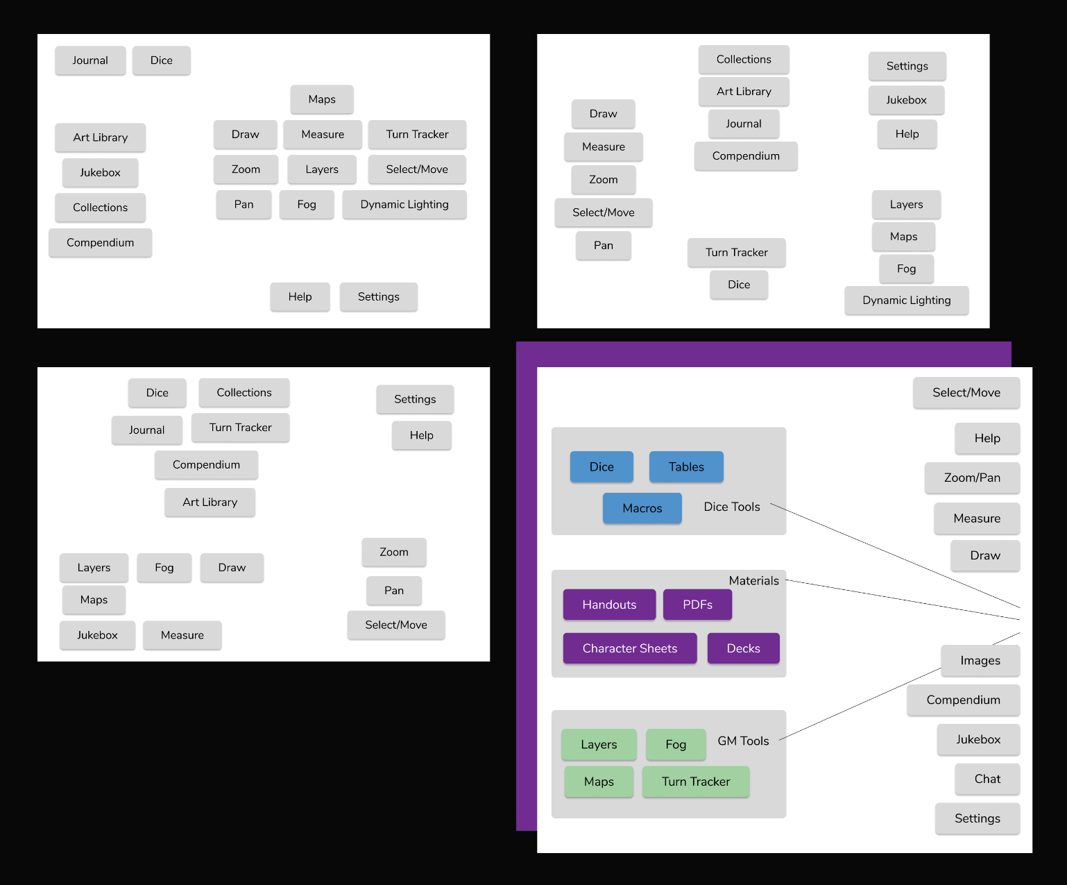
The challenge, of course, is that these are all true and important to an extent, but every user in the group made different associations based on their own use patterns. Furthermore, the interface has to meet the needs of multiple types of games: one might have a deck of cards, another might use only dice, a third might require users to draw pictures. And regardless of how the tools are grouped, all use cases need a majority of the screen space to be reserved for the game play itself (the map, the tokens, the drawing space, etc.). Solving the space problem in conjunction with the information hierarchy reorganization meant reiterating many wireframes.
UI Design: Wireframes
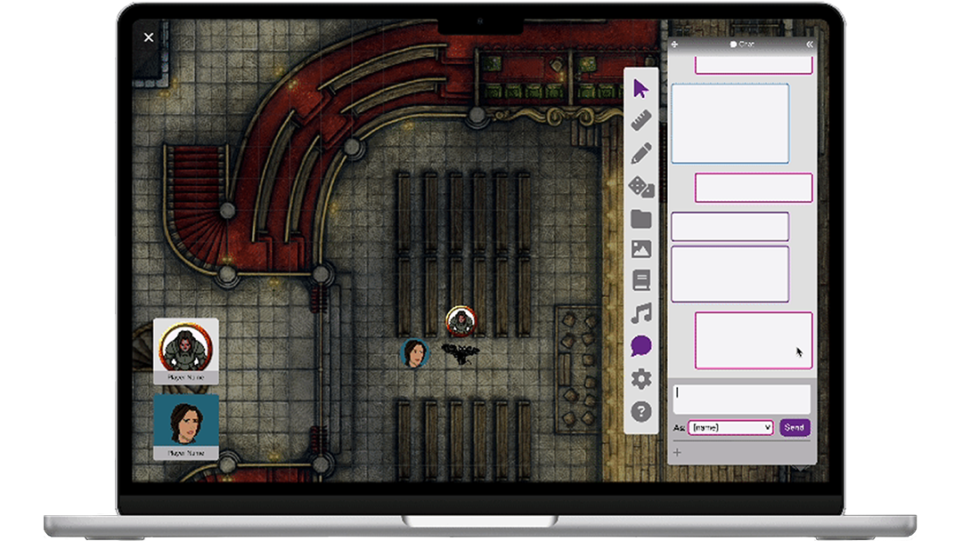
Scene: You’re logged in to Roll20 with a small group of friends, playing a session of your ongoing RPG. Your game uses a map, player tokens, dice, and character sheets, among other things. While playing, you need to move your token and see where it is on the map relative to other tokens. You need to roll dice to determine how far your token can move. You may wish to use the ruler tool to help strategize your next movement while awaiting your next turn. When rolling the dice, you reference your character sheet to see whether or not you get to add a bonus. Your frenemy rolls badly and you feel an urge to crow over them in the chat window. Said frenemy does not reply, merely making a face at you from their video window. Meanwhile, your GM (game master) has a window open with a list of all the players to track the turn order. They’ve set the tone with some epic background music playing from a playlist of favorite soundtracks. They have prepped half a dozen NPC (non-player character) tokens to represent people and monsters their players will interact with. They have three different maps prepared for this session as the players move from the tavern to the library to the edge of town. On one of those maps, they plan to hide most of the map from the players to represent a dark night—but the GM themself still needs to see the whole thing.
If you’re counting, the player has used three tools and interacted with three different windows or panels of resources—in the timeframe of one turn. Their GM can probably minimize some of their tools some of the time, but since the players have input on the speed, direction, and tone of the game, the GM needs quick access to at least four different panels/windows. Now imagine all of these elements arranged on a laptop screen. You still want to be able to see the map, your character token, others’ tokens, your friends in their video windows, and that chat window full of snarky commentary. And this is a quick snapshot of one type of game requiring one set of tools.
Setting up a new information hierarchy and wireframing the layout of the space were not successive steps, but concurrent. It took multiple drafts to determine how many top-level toolbars were appropriate without overcrowding the screen or potentially overwhelming users. How do multi-level menus open? If a user needs a window or panel to stay open for reference, while still using other tools and menus at the same time, where does that sometimes-open panel live? How should I account for tools with a few options or settings (like the ruler), versus something complex like a toolset for designing and saving maps?
Clearly the interface required easy paths to move or minimize elements, multiple top-level tools, and the capacity for both nested menu panels with many options and simple menus with few options. A general trend present in my wireframing journey was more tools taking up less space, to fewer tools with the option to expand them into more space. Much of my thinking here was driven by the question, “What would it look like for a user to use X and Y at the same time?”
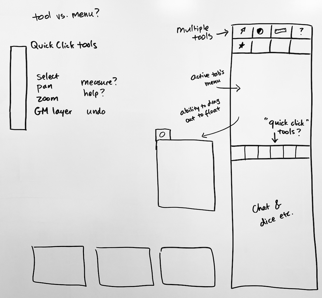
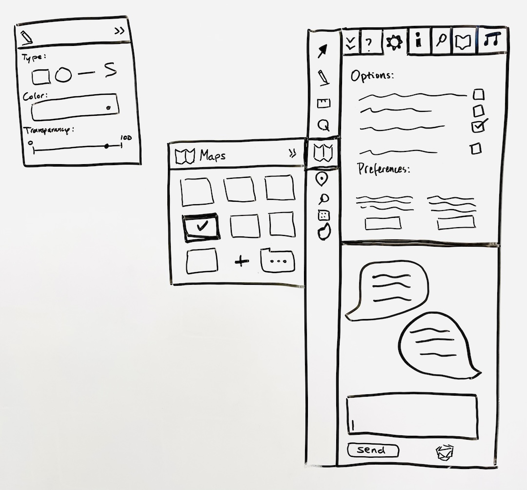
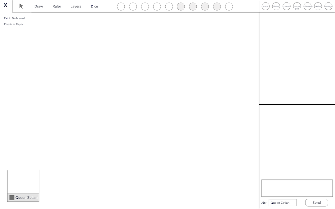
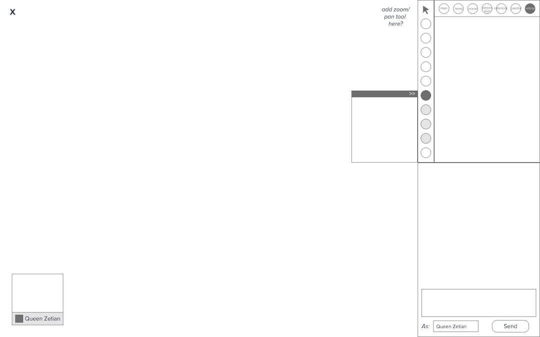
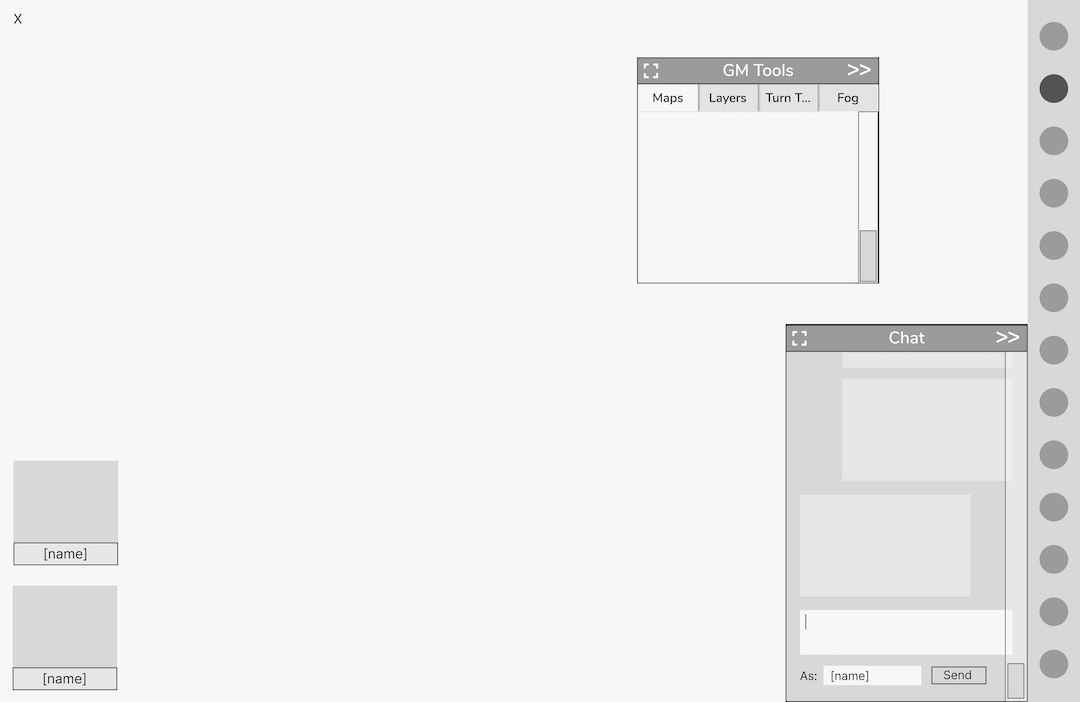
Remember that my goals were to minimize user frustration and lower the UI learning curve. Good organization and information hierarchy will help a user quickly choose a path of action from among many possibilities. Good use of space and visual hierarchy will guide them to the starting point of that path. Good signposts communicate that they are in the right place for what they seek, and visual consistency reaffirms directions while minimizing distraction and confusion. It’s time to talk aesthetics.
UI Design: Visual Style
This project is focused on the single screen where Roll20 users actually play live, virtual games together (called the “editor” on the site). But Roll20 has a lot more to offer: a marketplace for buying and selling games and accompanying assets, a wiki, community forums, an official help center, and a company blog. The blog has by far the most beautiful and consistent visual design of any part of this sprawling site, which prompted me to ask, what would it look like for the editor—the single screen that most of us use the most often—to be styled like this blog?
Visual consistency cuts down on visual confusion, so it would serve my overarching goals of minimizing user confusion to restyle the UI. I used the company blog to construct a style guide so that the main gaming page could fit into the same design system and better represent the company’s brand. The bright colors and gradients are eye-catching, but I knew I would need to keep their use minimal and discretionary, or I would reintroduce the same visual confusion I sought to eliminate. So I developed a set of grey tones that I could use for most of the interface, and relegated the fun colors to small accents or eye-catching interactive signals.
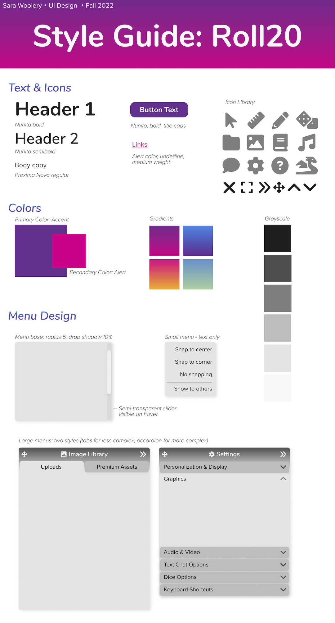
Another point of confusion identified in my initial evaluation was different icons that appeared to signify similar things, paired with indistinguishable labels. What is the difference between a journal, a library, and a compendium? When choosing icons for my newly-reorganized main toolbar, I was careful to choose icons and labels that more closely reflected the purpose of each of these three resource panels: the classic image icon for the image library, a folder for uploaded materials, and a book for the “compendium” (materials downloaded from the marketplace).
When designing menu pop-out windows, I looked at the existing menus to think about how to show or minimize more or less information, and settled on two styles that could cover a range of use cases.
I reimagined the chat window a number of times (see section on wireframing), but ultimately the existing chat functions well, it just needed a facelift to bring it in line with the brand. I used color coding, position, and different shapes of boxes to denote who was inputting the information (self or other) and what type of information (since the chat also includes dice rolls).
Prototyping
This project was my first experience prototyping in Figma. I first learned prototyping in Adobe XD, and learning Figma required me to start thinking in terms of nested frames: not just the look of the finished component, but its underlying structure. Given the way I wanted my toolbar, chat window, and menu options to behave, nesting components was a huge part of the learning curve.
Conclusion
Redesigning the main interface of Roll20 has been a complex project, and it could easily keep going through further iterations. However, through restructuring the information hierarchy, streamlining most top-level interactions into one toolbar, and creating consistency in the visual style, my redesign offers users a significant improvement over the original design, providing users with fewer initial pathways (to minimize overwhelm), clearer signposts and visual cues (consistent, familiar UI), and an organizational structure that can be customized to fit the many diverse needs of a wide range of users and their many different games.
